


Browse
Seeing Red! A Bold Color that Packs a Punch!
Design & Decor | PUBLISHED 07.11.17 | Jennifer Ventresca

Red is not for the faint of heart. It's the color of passion. It's the color of vibrancy and liveliness. Yet, people tend to shy away from reds not because they're dispassionate, but because they're uncertain about how to appropriately add red to their color scheme. We believe that red, in its various shades and hues, can pretty much mix well with any color scheme depending on how and where it's used -- and it can really pack a punch!
There are cheery reds, subtle reds, soft reds, hot and spicy reds. Red accents can draw attention to areas in the room that othewise might go unnoticed. (Think of a bull fighter with his red cape luring the bull towards him.) When it comes to red, we suggest the less is more mentality (which suprisingly originates from a Robert Browning poem, "The Faultless Painter").
If you're after a traditional design scheme, then use deeper, richer hues of red. Think burgundy, merlot, or reds with black/brownish undertone. Where to use? Consider a deep red leather Chesterfield sofa or an Oriental rug with dark reds.
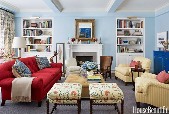
Photo from housebeautiful.com
If a modern flair is more to your tastes, then mix away. This is where you can mix traditional/classic shades with bold, primary reds. This is where a large, bold multi-shade piece of artwork can set the palette and then you can add pieces to tie it together (from pillows, rugs, furniture pieces to accessories). Just do it with an editing eye -- too much red can send your guests into sensory overload.
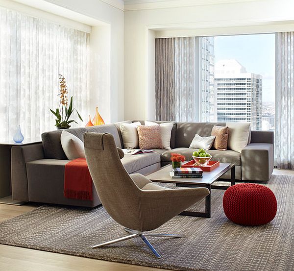
Modern Living Room, Decoist.com
For those who want the best of both worlds, traditional blended with modern, a transitional design esthetic using red is best accomplished by keeping a fairly neutral color palette and integrating a few soft, subtle pops of red. Consider a red vase, lamp, artwork, or set of books.
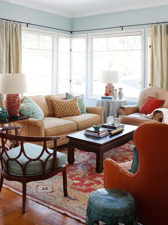
photo from bhg.com
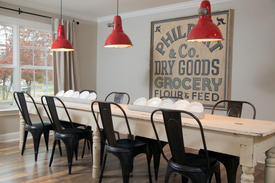
For a country chic design, consider a neutral color pallete and add your pops of red through fabrics, bric-a-brack/knickknacks, lighting or maybe one furniture piece (perhaps a farm table in a soft, antiqued red). Think along the lines of barn red or apple red; basically reds with purple undertones.

Photo from HGTV.com
Here are some other examples of well-done red.
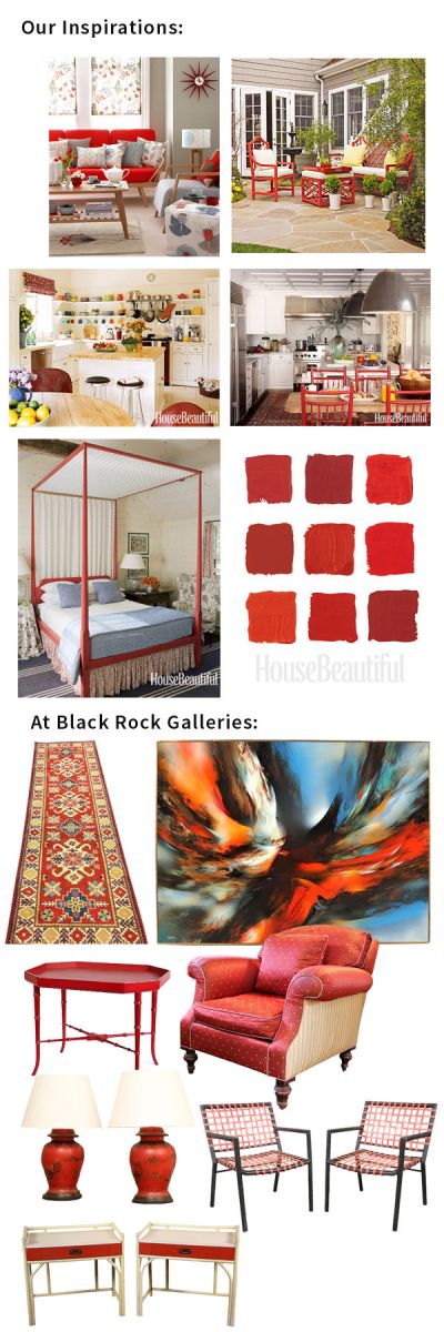
Check out some other decorator inspiration photos along with current examples of BRG merchandise that could help you achieve this look by visiting our Pinterest board: Seeing Red!
Keywords: bold, red, interior decor, designing with red
SIGN IN TO COMMENT


Authorized dealer on

JOIN OUR MAILING LIST
Powered by AuctionNinjaAuthorized dealer on
|| Our Locations ||
Bridgeport, CT - Get Directions | Greenwich, CT - Get Directions | Waltham, MA - Get Directions | Apex, NC - Get Directions | Fairfield, CT - Get Directions | Southport, CT - Get Directions